TOKYO COLOR
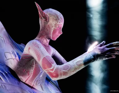
Landscape inspiration drawn upon the chest.
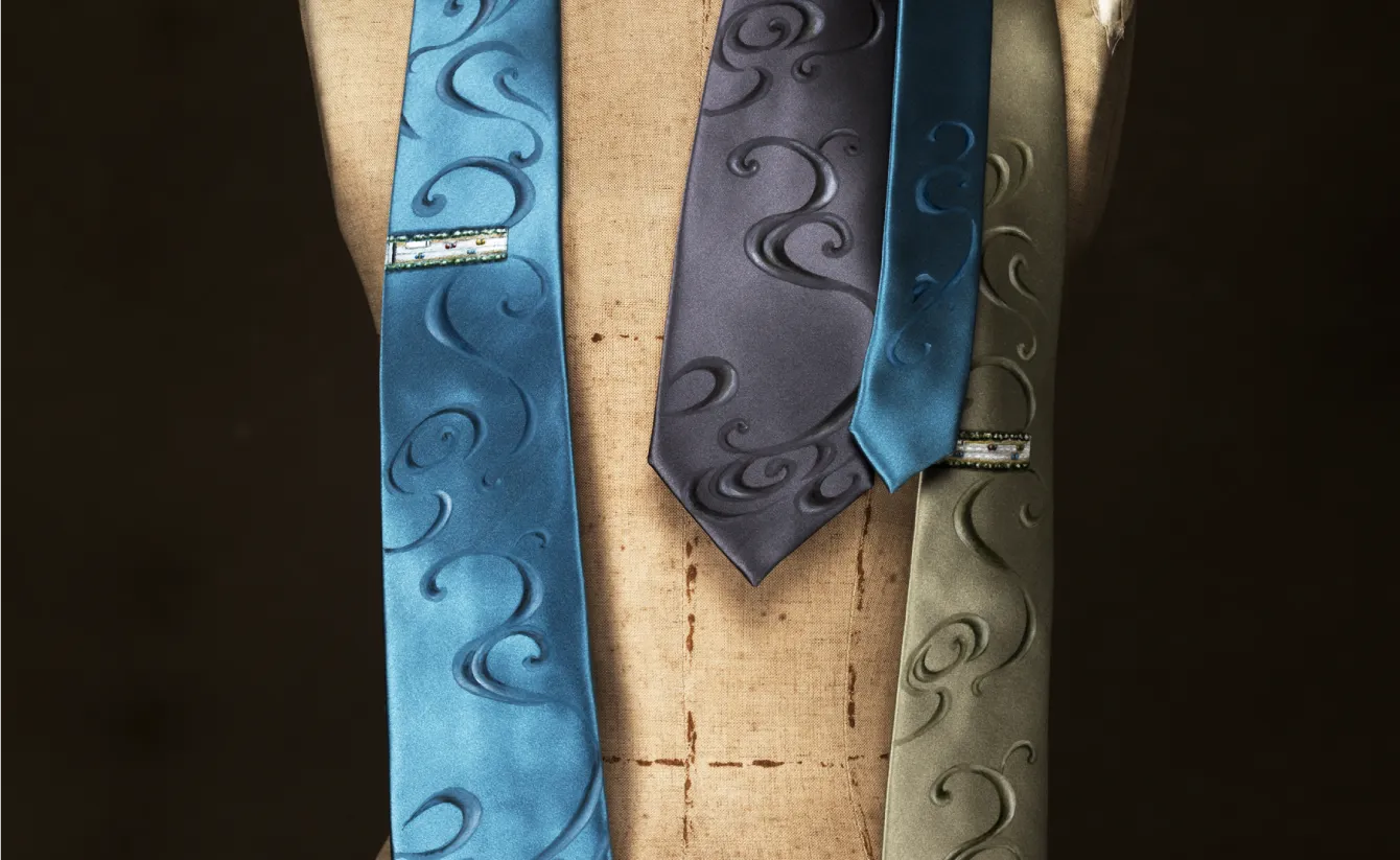
Landscape inspiration drawn upon the chest.
A product development that reimagined "Tokyo Yuzen" by designing and drawing patterns from contemporary landscapes. Yuzen is a technique of drawing and dyeing motifs of flowers, birds, wind, and the moon with brush and dye onto textiles such as silk and cotton used for kimono and obi. Since around the end of the Showa era, as the kimono became less widespread, the technique has drawn less attention and few people wear it.
The name Yuzen derives from Miyazaki Yuzensai, a fan painter of Kyoto in the Edo period; his fan paintings gained popularity around the Genroku era, and dyeing that style as patterns on kosode garments became Yuzen dyeing. It later developed in various regions such as Tokyo and Kaga. Today, type-dyed or printed imitations of Yuzen are often sold as Yuzen, and KiQ—focusing on the coexistence of nature with a Japanese aesthetic, in which Tokyo Yuzen's refined taste rooted in Edo's sense of living and beauty has been favored—drew on the characteristic that it is a Yuzen with room to expand, re-converting contemporary Tokyo landscapes into patterns and projecting them onto textiles.
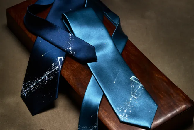
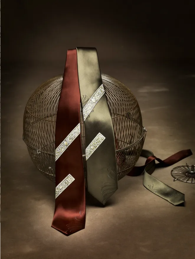
In the Edo period, Edo Yuzen designs developed freely and unrestrained across all social strata—chic patterns among the townspeople, refined realistic floral patterns in the uptown districts. Characterized by creating without distinction of technique or pattern style, Tokyo Yuzen, the evolution of Edo Yuzen, is also known as "creative Yuzen."
In Paris, France, where tradition and modernity subtly interweave, lace—a decorative traditional technique that had fallen out of fashion in the 1970s—was felt to be old-fashioned amid the unisex trend, but from the late 1970s to recent years it has been used by designers and couturiers and remains present in many collections today, even used as an avant-garde element in the menswear proposed by Jean-Paul Gaultier.
In that way, TOKYO COLOR is a prototype that distilled a technique that had remained an old form, like the kimono, into a form of creation. Capturing the streetscape visible in this very moment in an emotive way and distilling it into patterns, it gently harmonized the conscious sensibilities that exist in Japan.
- Client
- TOKYO
- Year
- 2016
- Team
- Direction: Akane Kikuchi
- Partner
- RIQUU, JEKI
- Category
- Brand & Identity